

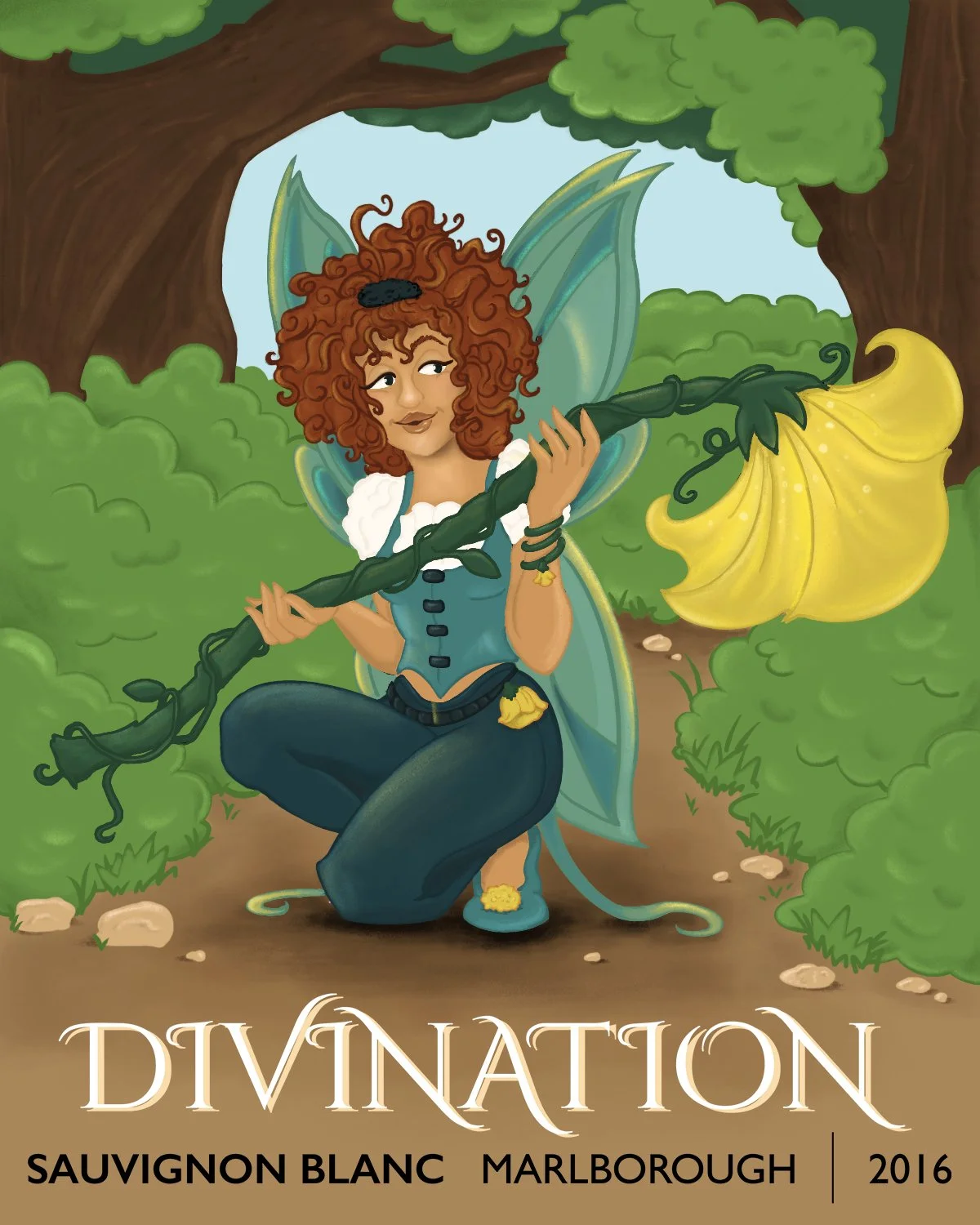
Woodland Fairies
The Woodland Fairies series is a set of original character designs created to capture the unique essence and flavor profiles of Divination Wine’s three varietals: Pinot Noir, Pinot Grigio, and Sauvignon Blanc. Each fairy is a visual embodiment of the wine’s personality, translating tasting notes and aromas into a whimsical, illustrative style.


Objective
The illustrations blend fantasy elements with modern packaging design trends, using:
Bold, saturated colors for high shelf impact.
Hand-drawn textures to enhance the artisanal feel of the wine.
Elegant serif typography for a premium, sophisticated touch.
Concept Development
The inspiration for the Woodland Fairies emerged from the rich sensory experience of wine tasting. Each fairy was designed with colors, textures, and moods that reflect the wine’s flavor profile:
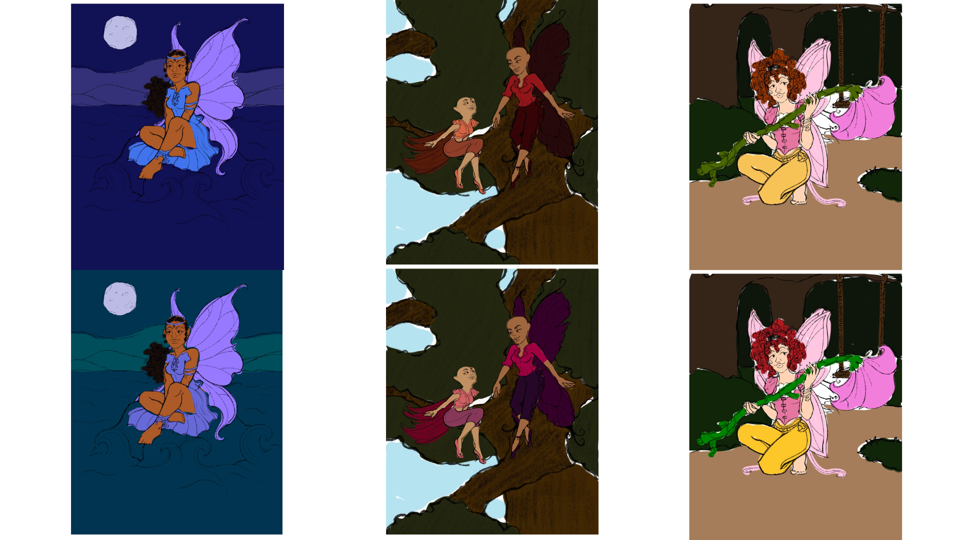
Pinot Noir Fairy – Mysterious and alluring, with deep purples and warm reds echoing the wine’s dark berry notes and velvety finish.
Pinot Grigio Fairy – Cool and serene, set against a moonlit backdrop, evoking the crisp, refreshing qualities of this white varietal.
Sauvignon Blanc Fairy – Vibrant and playful, surrounded by lush greenery, embodying the bright, citrus-forward profile of the wine.
Process
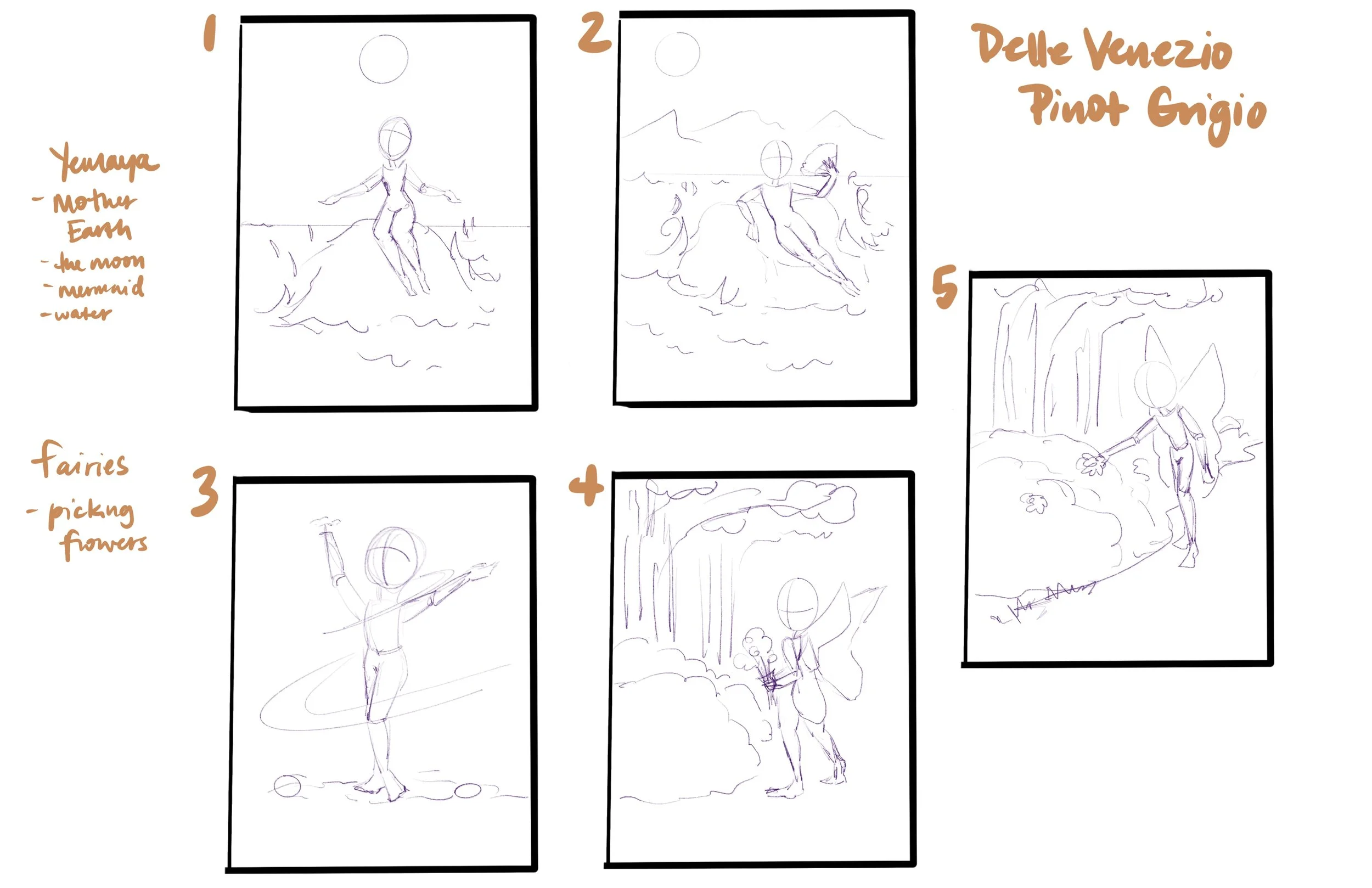
Thumbnail Sketching & Ideation
Sketching & Character Development – Each fairy was conceptualized through multiple thumbnail sketches in Procreate, refining poses, facial expressions, and thematic details.
Color Exploration – Palettes were carefully selected to align with the wine’s tasting notes, ensuring each label had a distinct visual identity while remaining cohesive as a collection.
Final Rendering – Detailed line work and shading were applied in Procreate to give depth and personality to each fairy.
Label Layout – Final artwork was transferred to Adobe Photoshop for typography integration and composition adjustments, balancing the illustration with essential wine information.


Final Deliverable
The Woodland Fairies series successfully transforms the sensory notes of wine into enchanting visual narratives. While designed as a mock project, the labels demonstrate a strong potential for market appeal by merging storytelling, character design, and product branding into a single cohesive package. This project was an opportunity to merge two creative worlds—illustration and product design—into a vibrant, collectible series. The process emphasized the importance of translating abstract tasting profiles into tangible, emotionally resonant visuals.

